How These 3 Homepages Are Designed to Convert Visitors Into Leads
Answering the question, how to convert visitors into leads, should be the first goal of every website design. In my opinion this is something that is often overlooked by designers as well as marketers. I wanted to write this article in order to simplify things and offer a bit of inspiration. Here are 3 examples of homepage designs that exemplify the traits of a quality lead generating website design.
The first example homepage: www.CapTap.com
– CapTap helps your business get the funding needed to keep business flowing.
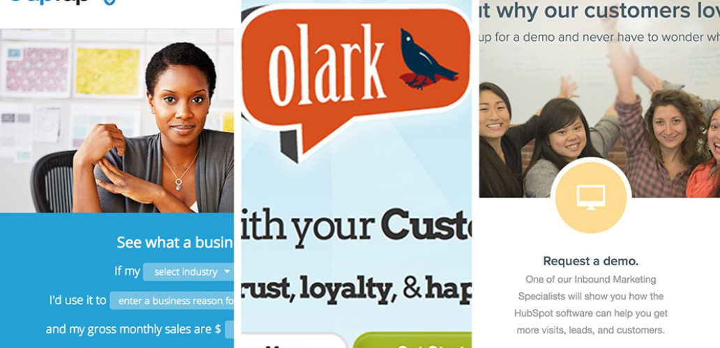
When I first came across CapTap, I was immediately intrigued by the story telling aspect of the loan estimator. I felt almost compelled to fill in the blank to discover my own story of what kind of business loan I could receive. Of course I completed the form and excitedly pressed “get started”. The story continues with the estimated loan amount and a form to complete.
Why is this a great lead generating homepage design? For starters, one of the best ways to capture peoples attention is to tell a story. The design draws in the visitor with not just any story but one that is personalized. Next, we come to a section that answers some typical questions that visitors might have. This is a section that is often missed by designers and not emphasized enough by marketers. Overcoming common objections is a vital part of the sales process and getting them out of the way at the very beginning is a great way to start.
Our second example: www.olark.com
– Chat with your customers.
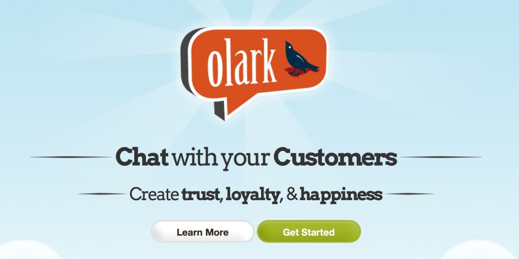
When first landing in their homepage we are greeted with Olark‘s logo, description and tag line. We know exactly what they do, and the benefits that they provide to their customers. “Chat with your customers – Create trust, loyalty, & happiness.” Wow that’s awesome, what business owner doesn’t want this? There are two distinct call-to-actions: Learn more & Get Started. The dual CTA’s speak to buyers at different stages in the sales process. Learn more is for those that are in the research/discovery phase and get started is for those that are on the edge of buying or are in buy-now-mode. Overall it’s an excellent homepage for converting visitors to leads or even customers.
Third Example Homepage Design: www.HubSpot.com
– All-in-one marketing software.
I might have a certain affinity towards HubSpot since we are certified HubSpot partners however I promise that I’m using them as an example because their homepage really does lend itself for conversions. The two previous examples are certainly implemented quite well on the HubSpot homepage but they have taken their CTA’s to a whole new level. After scrolling through a lot of features and benefits and testimonials we come to three CTA’s that are hard to pass up.
- Questions? Call us.
- Request a Demo.
- Start a free trial.
When we mentioned the different buying phases earlier we really only had two to choose from. These CTA’s encompass all three. Questions? Call us. – this overcomes the detailed research phase. Request a Demo – this is for those that are in the middle of the process and are choosing the right service/product for their needs. Start a free trial – this is for those that know what they want to but and are ready to make a decision, right after getting their feet wet, hands dirty or whatever kind of analogy you want to throw in there. Overall the homepage design provides a great avenue for visitors to convert into leads.
Summary
What were the best lead converting aspects of these homepage designs? They each had professional graphics, were well written and thought out.
The main takeaways:
- Say what you do (Tell a story)
- Say why you do it
- Use multiple CTA’s for different buying stages
- Overcome objections by answering buyer questions.
So, it might be time for some of you to send your homepage back to the drawing board for further review. Your website is a major player for your inbound marketing. Getting visitors to your website is one part but converting visitors to leads is the next step of the process. Design an inviting homepage with what you do, why to do it, CTA’s, and answers to common objections and you’re on your way to converting more leads and making more sales.
If you’re considering an overhaul of your website design or just want to implement what you’ve learned about lead generating homepage designs check out our ebook: A Website Redesign Guide – 7 Steps to Optimize Your Website to Increase Leads. This eBook serves as a blue print for business owners and marketers who want to capitalize on their most important Internet marketing asset: their website.
[hs_action id=”12028″]


