
10 Examples of What Makes Good Print Advertisements
The key thing to remember here is that we’re dealing with nonmoving print, not a video production. Therefore it has to be eye catching and hold the viewers attention. The viewer needs to be able to zoom in on one specific thing. I think a truly good print ad takes the viewers preconceived notions about a product and uses it to the product’s advantage. They take what you already thought about something and give you a Eureka moment. I.e. a moment of clarity or insight that just feels good. Below I’ve compiled my favorite print advertisements from 2011, and my reasoning behind why they’re good.
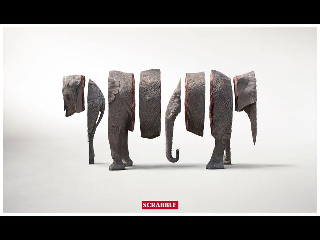
Scrabble– I love this advertisement because when you first look at it you can immediately tell it’s a segmented elephant. The ad forces you to imagine what all of the pieces look like together. It’s kind of fun trying to picture the pieces in place. Then you see the word Scrabble below, and another connection is made. Playing Scrabble might be like imagining this elephant in one piece. In playing Scrabble you take the seven letters allotted to you and try to make words out of them. If you can fit all seven together it’s a ton of points, and you almost always win the game. With this ad we’re given eight pieces of an elephant. Elephant is an eight letter word. We imagine the elephant in one piece, and it’s like winning at Scrabble. It makes you think about scrabble in a fun and exciting way.
Band-Aid– This advertisement makes the assumption that the viewer knows who The Hulk is. It also makes the assumption that if this Band-Aid is flexible and strong enough for a hulking super human it’s strong enough for anyone. It plays to the fans of The Hulk movie that came out in 2011.

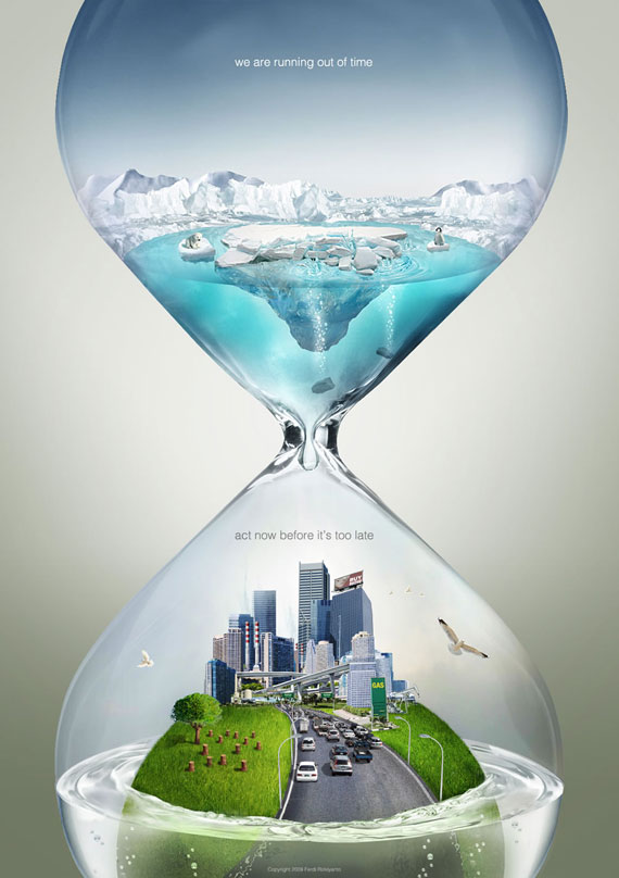
Our time is running out– In part I chose this advertisement because of the stark color contrast between the top portion of the hourglass, and the bottom portion. The top half shows a baby penguin and a baby polar bear sitting on small pieces of ice that are melting. All the melting water is dripping down into the city. It gives a sense of urgency on either end of the hourglass. Everybody loves baby penguins and baby polar bears. This ad also plays to the idea that the polar ice caps are going to melt and destroy modern civilization if we don’t do something right now. It shows a lose lose situation that needs to be dealt with urgently.
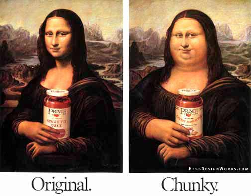
Original vs. Chunky– I chose this ad because the Mona Lisa is such a recognizable face and this advertisement plays to the lighthearted idea of her being chunky. It’s a funny play on words. The Mona Lisa has always been the subject of debate on whether or not it’s authentic. This ad makes fun of the long standing debate urging consumers that maybe being light hearted by going chunky could be fun.
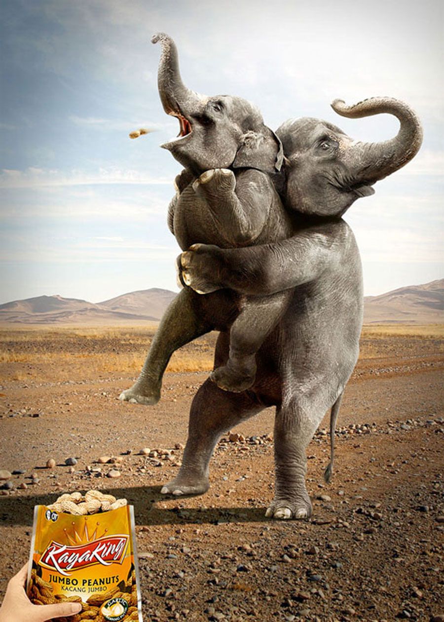
Jumbo Peanuts– This ad is hilarious because of the common knowledge (even if it’s not necessarily true) that elephants love peanuts. The idea is that these peanuts are so big elephants will even choke on them, if they aren’t careful. The mother elephant saw her child choking and does the Heimlich maneuver. It’s just hilarious, and looks great too.

Sharp knife– This ad appeals to a sense of humor while showing that this knife is so sharp it will cut through the carrot and the cutting board. This knife cuts deeper than any other, no matter the strength of its wielder. It takes people’s preconceived notion that carrots aren’t the easiest thing to cut and takes it to the next level by chopping up the cutting board.
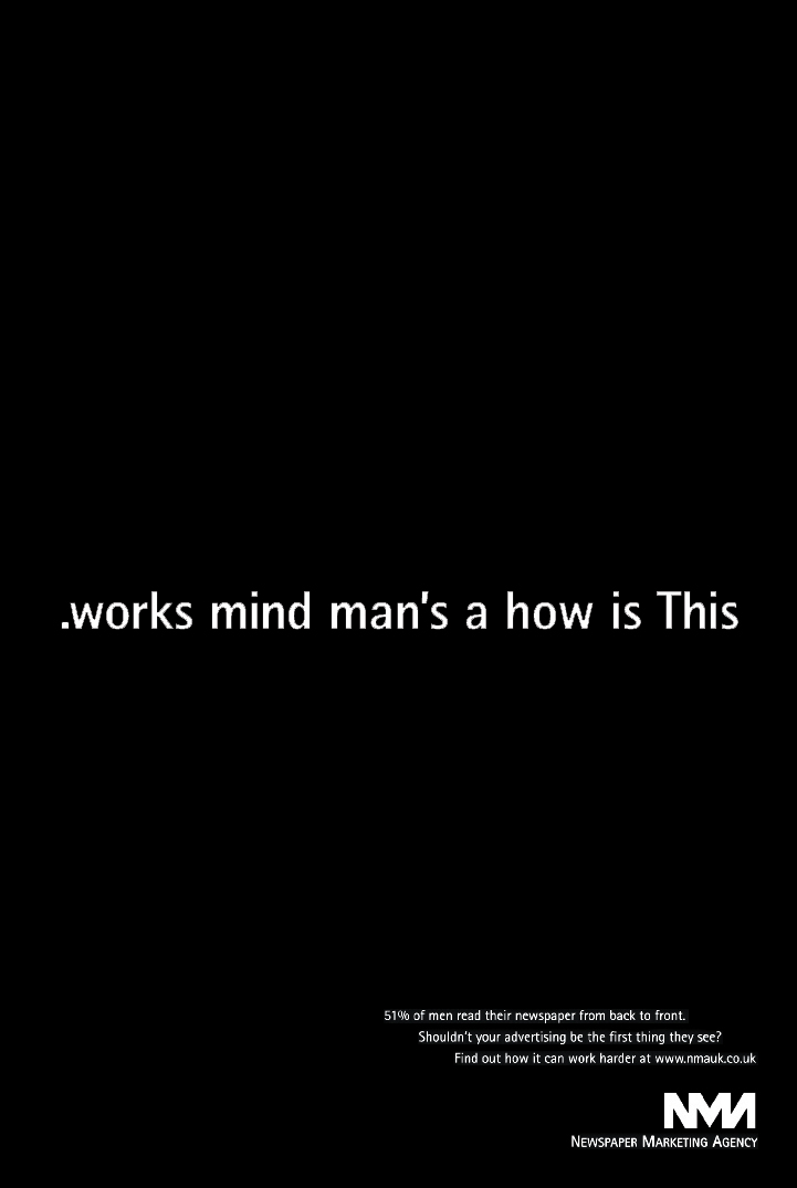
.works mind man’s a how is This- This ad takes an extra second to read, but after catching the main phrase I immediately want to know what they’re selling, and whether or not men really read things backwards. They provide the statistic and a link to their page. The initial hook is strong enough to draw in customers. This ad makes me think that sometimes the simplest strategy is the best.
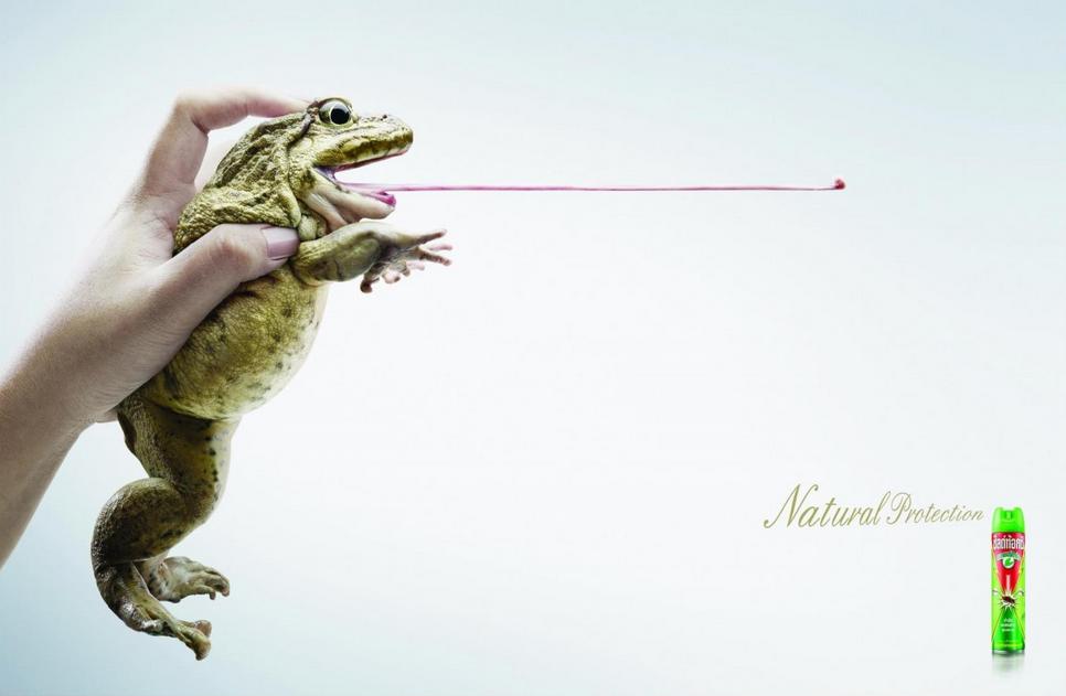
Insect Repellant– I like this advertisement because it plays on the idea that frogs eat flies. Having this bug spray on is like having a frog protect you from flies. This is so funny in print especially paired with the phrase “Natural Protection.” It also gives this the consumer the idea that their product is earth friendly as well.
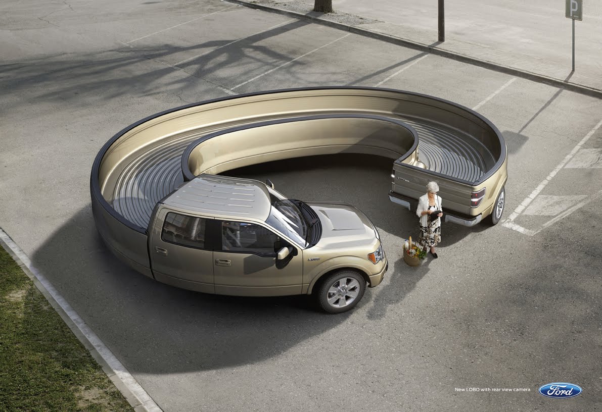
Ford– I like this advertisement because it takes a second glance to realize this truck is backing up. At first glance we assume that having this truck is like looking straight ahead to see what you’re backing into. This ad also plays on the fear of not knowing who could be behind you while backing up, this truck alleviates that fear.
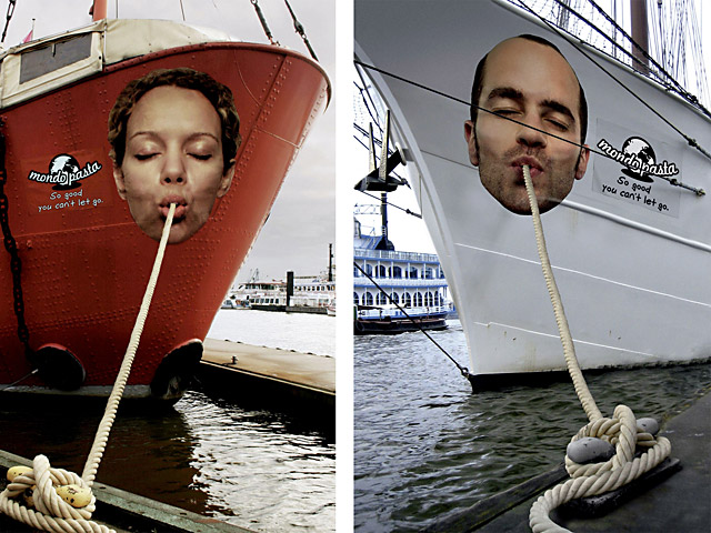
Mondo pasta- This advertisement is so inventive. I especially like how they’re placed on the sides of ships using the natural placement of the ropes as pasta. I think that’s what’s really smart about this one, the placement. Not to mention having individuals peoples’ faces on each ship makes them more memorable.
In summation all of these advertisements are good because they make you think and help you make a connection with the product they’re showcasing. I chose these specific ones after hours of searching through online. These ones were the most unique, and each holds a place in my memory because they do what they’re supposed to; they help people make a positive connection between the products and the rest of the world. Contact a trusted and proven Atlanta graphic design company today.
